A Spotter’s Guide: Scotland’s Historic High Streets
Architecture | Written by: Jennifer Farquharson | Thursday 25 March 2021
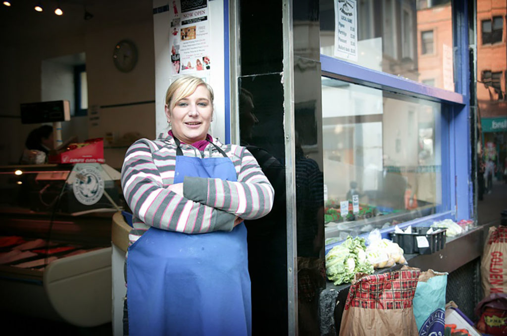
© Sam Sills
We all have memories connected to our high streets. Like who sold the best sweeties when you were a kid? Where did you buy your first album?
Our high streets, and the shops that line them, are more than our memories. They tell stories about the creativity and innovation of our own local areas. More importantly, they have a vital part to play in our future.
In this blog, learn how to spot the special historic features of Scotland’s high streets. Discover what they can tell you about the past and future of Scotland’s historic shopfronts.
Look for a sign
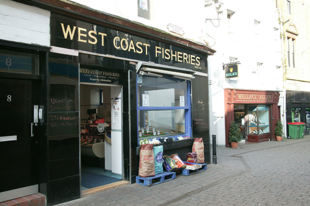
A glossy, bold, modern shopfront with gilded lettering © Sam Sills.
No doubt, you’ll find sleek, modern signs adorning shops today. But shopkeepers, designers, craftspeople and architects have kept our high streets up to date with the latest trends for hundreds of years.
Polished, glossy signs became popular in the early 20th century, especially during the modern movement architecture of the 1930s. They were made of materials like vitriolite (high-strength, coloured glass), marble, granite, chrome and brass which could be expensive to import. So, successful business owners used them to show off their wealth.
It took teams of craftspeople to give shops their distinct style; stonemasons, engravers, carvers, joiners and woodworkers, gilders, signwriters, metalworkers, architects and specialist shopfitters all played their part. You can learn more about these people in this online exhibition on historic shops.
Ghost signs
Some of the more unusual evidence of this creative past are “ghost signs”. Find some great examples on Twitter @ghostsigns. These are imprints or remains of old shop signs. They’re often discovered during conservation works under timber, marble or other claddings and give a tantalising insight into the history of the building.
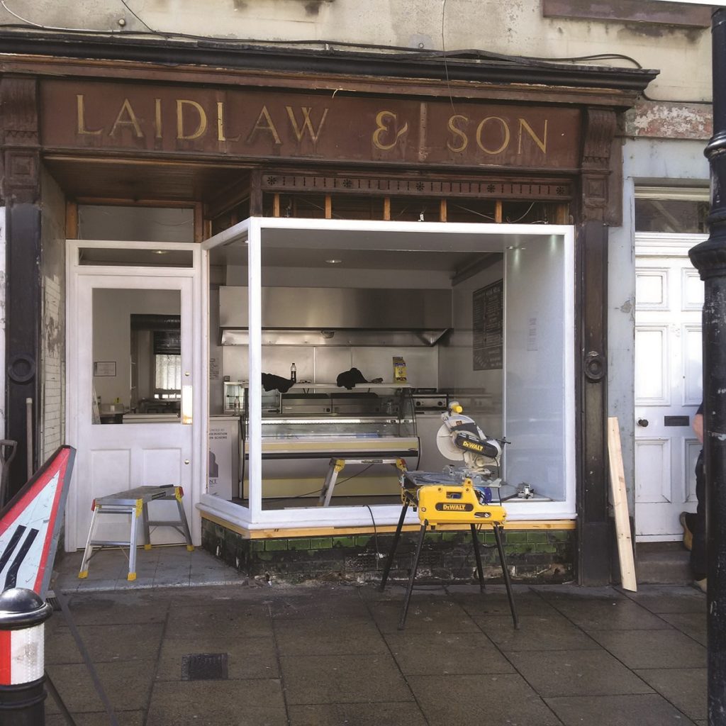
Ghost sign discovered for “Laidlaw & Sons” during works on a shopfront, when the newer fascia was removed.
Peek in the window
Windows can tell you so much more about a shop than what’s inside. Glass was one of the most significant materials in shop design. As the technology advanced, so did the appearance and architecture of our historic shopfronts.
If you picked up a Christmas card this year, you’ll be familiar with the image of the quaint village shop: thatched roof, cute sash and case windows. Well, in the early years of glass production, we could only produce small panes of glass. So windows were made of several panes held together by glazing bars, known as astragals.
Early forms included plate glass and crown glass from the later 17th century. You can easily spot crown glass thanks to the ‘bubble’ or ‘bullseye’ in the middle of the panes. During the second half of the 19th century, the panes of our shop windows grew larger. In rural towns and villages, smaller paned windows prevailed for longer.
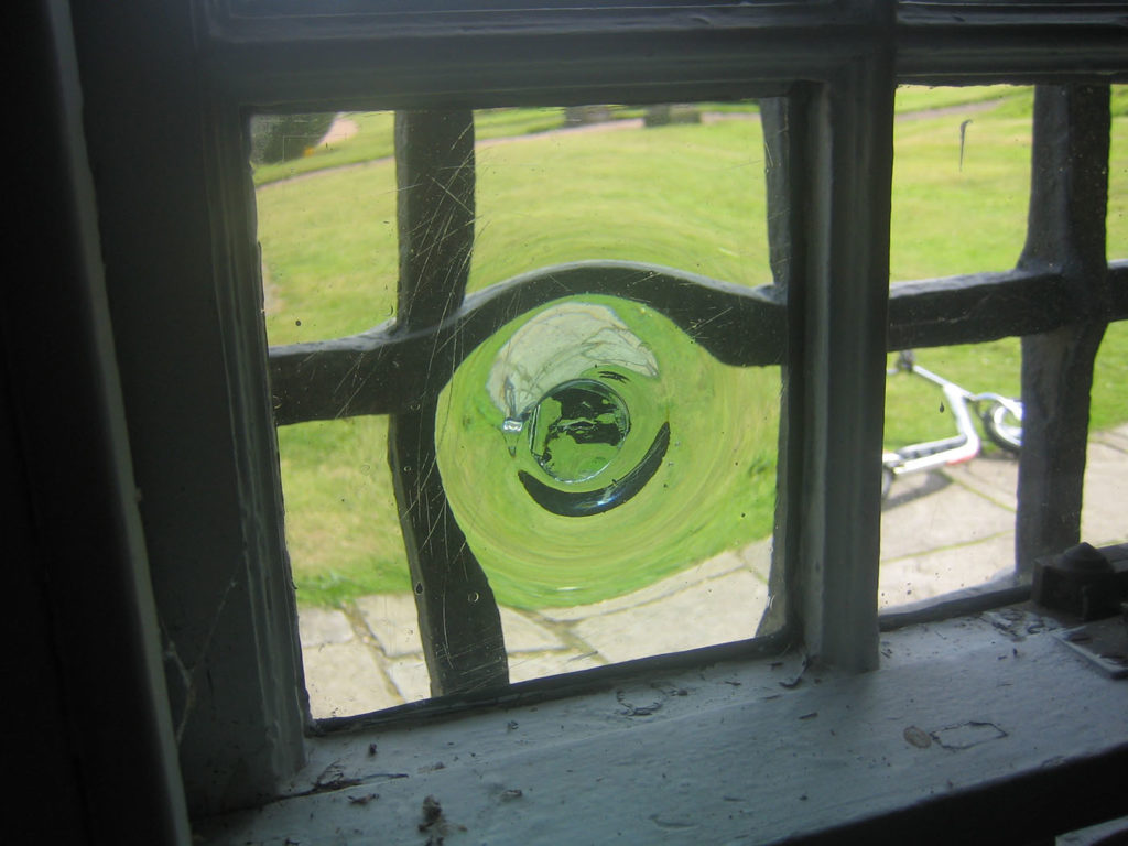
Crown glass, identifiable by the “bullseye” detail in the centre of the pane
Then we started getting a little more adventurous. Stained glass was fashionable in Edwardian shopfronts. It created classy frontages which were particularly striking from the inside. Curved glass was seen as elegant, and it created inviting lobbies for fashionable Edwardian and interwar shops. Geometric etched glass was favoured in 1930s favoured in shops with Art Deco styling.
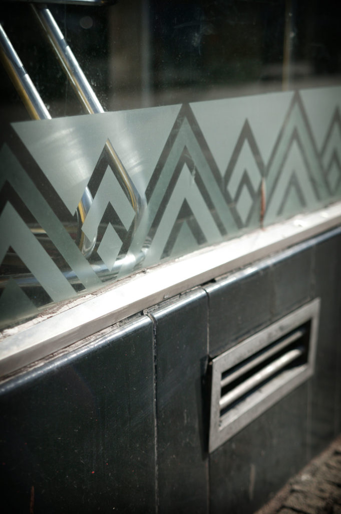
An example of etched glass popular in 1930s Art Deco design. © Sam Sills.
Spot the details
Look down the next time you enter a shop on your high street. Is there an elaborate mosaic floor, which has nothing to do with the shop you’re entering? Victorian shopkeepers could use mass-produced ceramics for the first time, and evidence of this survives today.
Mosaics and other tiles were used for entrances and floors as beautiful, hard-wearing finishes. Mosaics were created using tiny pieces of marble, stone, ceramic or glass known as tesserae. Patterns of contrasting colours attracted customers and were easy for shopkeepers to clean.
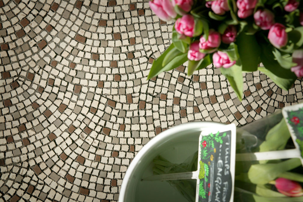
Mosaic floor in Crieff. Mosaics were eye-catching for customers and were durable and easy for shopkeepers to clean. © Sam Sills
Mosaics also went through different fashions throughout their history. The names of businesses or their owners were incorporated into tiles in Edwardian shops. Meanwhile, in the 1930s, black and white tiles were popular.
Tiles and ceramics became a way for retailers to build their brand. Thomas Lipton set up his first shop in Glasgow in 1871. Within 30 years, he had 500 shops selling butter, eggs, tea and ham to the working classes. His shops were known for their contrasting tile schemes and the famous ‘L’ monogram tile. Lots of food industries followed his example including Maypole Dairy Company and the Buttercup Dairy Company, because tiles gave the impression of cleanliness and hygiene, whilst being visually appealing.
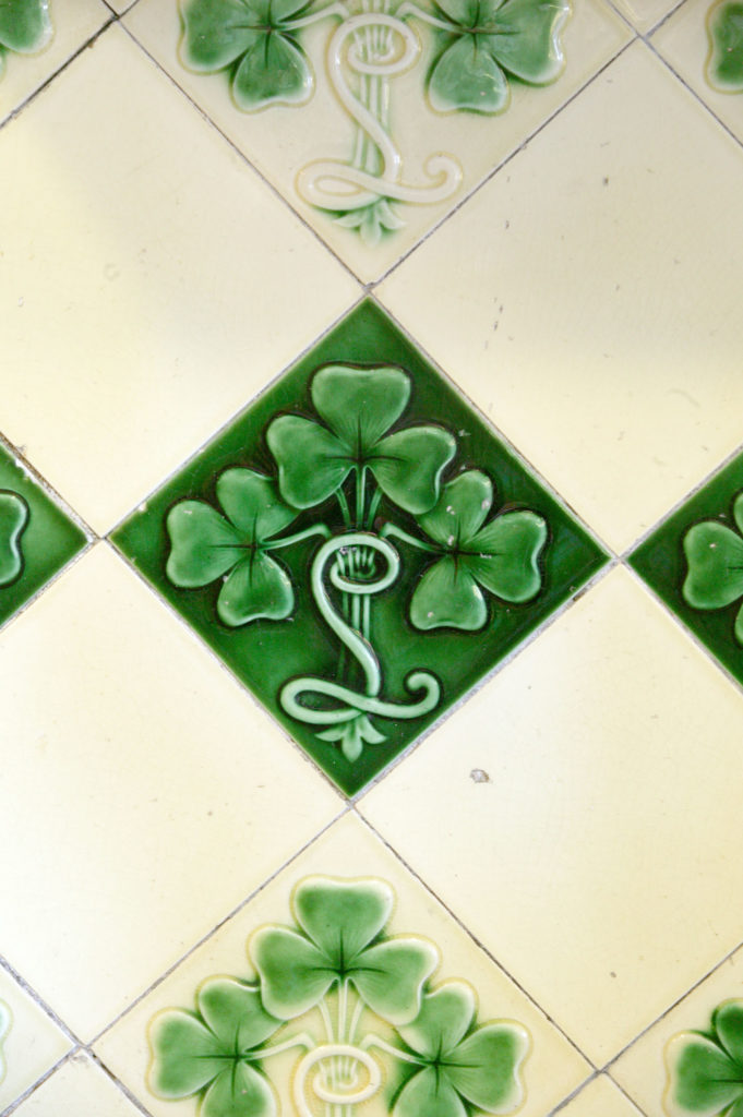
Chain stores commissioned tiles to promote their brand. This tile depicts shamrocks and an ‘L’ for Lipton in Arbroath.
Show us your shops!
Share your local historic shopfronts with us on Twitter @HESEngineShed.
Travel through time to explore Scotland’s shops through the centuries in our blog.
Learn more about the architecture of Scotland’s historic shops and the materials used to make them.
Support for traditional shop owners and communities
Historic Environment Scotland help to keep the character of our high streets by providing grants and funding for conservation works.
Conservation Area Regeneration Schemes are a great way to support heritage-focused community and economic growth projects within Conservation Areas across Scotland. Local City Heritage Trusts may also provide funding for building conservation.
About the author:
Jennifer Farquharson
Jennifer Farquharson is a Content Officer at the Engine Shed. Jen creates engaging content about our sustainable conservation centre.
View all posts by Jennifer Farquharson


